Debate has long raged over the best system for communicating the nutritional value of food and drink products. Sometimes we just need to follow the evidence, says Nick Hughes.
It’s the middle of August; peak holiday season, and in the grand tradition of national newspaper columnists I have managed to contrive an entire article from a minor cultural distinction I experienced while holidaying in continental Europe.
Stick with me food policy fans, for the subject of this particular whimsy is not the recklessness of Italian drivers nor the Greek penchant for an afternoon siesta but my first sustained encounter with the Nutri-Score label. I can’t say it was a wholly positive experience, but more on that later.
First, to recap: the UK and continental Europe have largely diverged where front-of-pack nutritional labelling is concerned. After a protracted debate some 15 years ago over whether traffic light labels or guideline daily amounts should be the standard scheme for UK food and drink products, a critical mass of businesses settled on a hybrid of the two whereby salt, sugars, fat and saturates each receive a red, amber or green score to indicate high, medium or low content, supplemented with a percentage figure denoting the proportion of your daily allowance of each nutrient contained in a single portion.
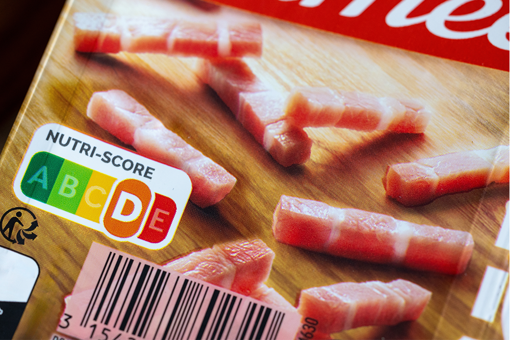
The European food and drink industry subsequently went in a different direction with first France and then other countries including Belgium, Spain and the Netherlands landing on the Nutri-Score as their favoured solution. In contrast to the traffic light label, Nutri-Score is a composite label which brings the nutritional information about a product together in one single score ranked from A to E, with A being the healthiest. This has the advantage of being simple and easy to understand, but for those who like a bit more depth to their nutritional information it can feel rather deficient.
I fall firmly into the latter category. Scanning the aisles in the local Aldi during a self-catered family holiday in the Netherlands, I found myself constantly flipping products over to seek out the mandatory, and often much harder to decipher, nutritional information on the back of pack. How much sugar are in these kids’ yoghurts that score a B? Why has this seemingly healthy bottle of apple juice been given an E? How on earth has this chocolate cereal scored an A (thanks to an eagle-eyed David Burrows for this bewildering discovery during his own holiday in France)?!
I realise I am not your average shopper. I write about food for a living which puts me among the relatively small cohort of people who fully engage with the detail of food labels. Yet I can’t shake the feeling that the Nutri-Score is just a little too opaque (show me the working) and oversimplified.
Yes, multiple traffic lights are less intuitive and, yes, you have to make your own trade-offs between different nutrients – but the greater depth of information surely gives a traffic light label the edge?
Or does it? Leaving personal opinion to one side, numerous studies (including this one from Portugal and this onespanning 12 European countries) have shown Nutri-Score to be most effective in informing people of the nutritional quality of foods and helping them identify healthier options.
It’s a classic example of an intervention that responds to how people behave rather than how we would like them to behave. I might care about the daily quota of sugar I’m consuming by eating a bar of chocolate, but many people just want an at-a-glance signal of whether something is essentially good or bad however imperfect that information might be.
You won’t persuade me, the shopper, of the appeal of the Nutri-Score; however me, the food policy pragmatist, will try to keep an open mind next time I’m stocking up on continental groceries.

